|
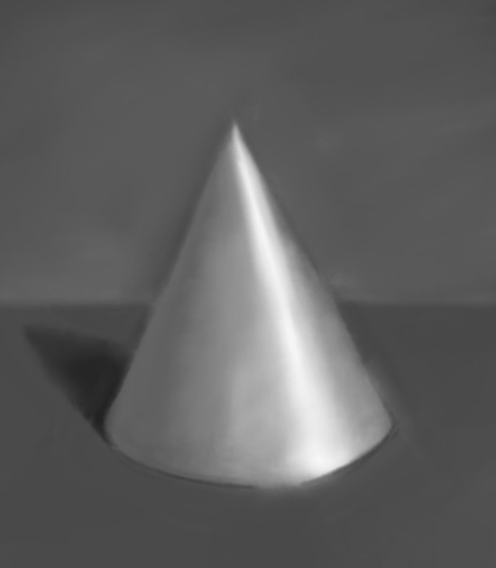
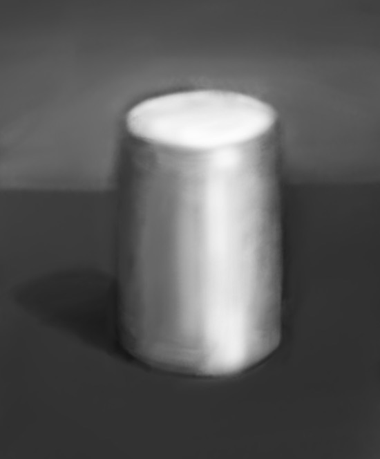
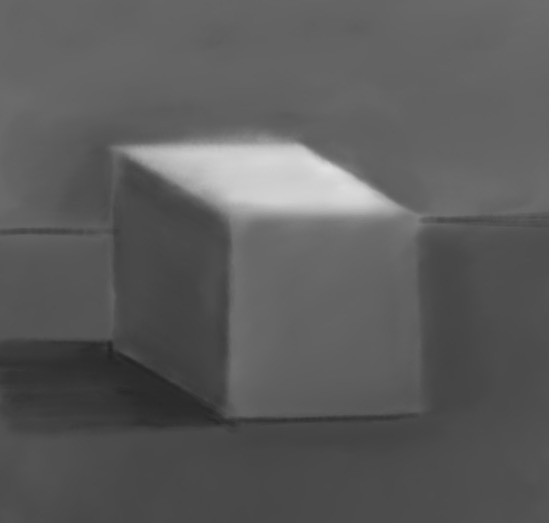
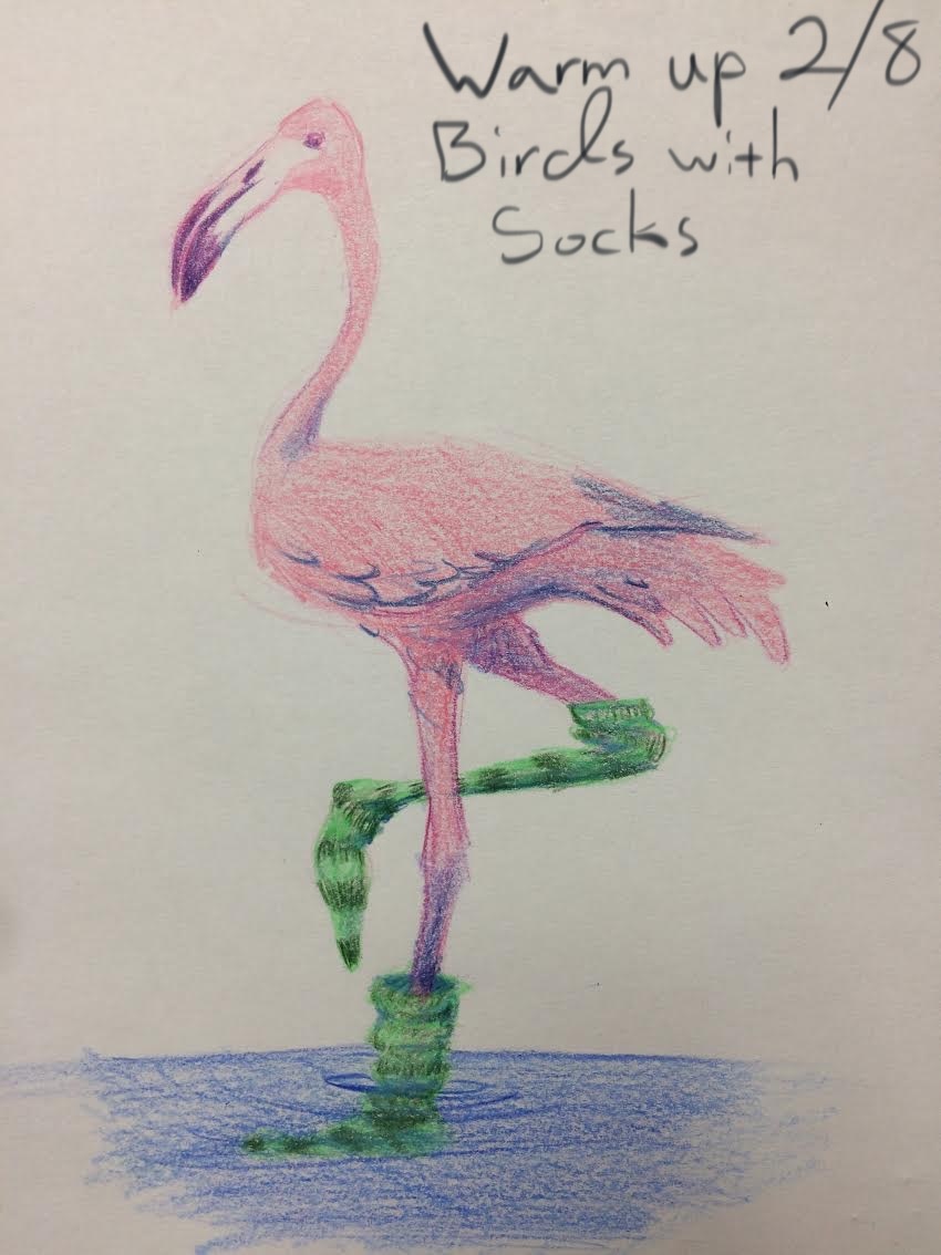
Warm up: Draw a nice hat on something that doesn't usually wear hats. 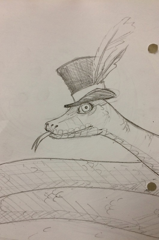 Warm up: Draw your most recent (or most memorable) dream or nightmare. 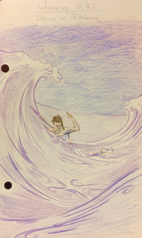 Class Assignment: Use your eraser to draw Subtractively by erasing out the highlights on a sphere, cube, cone and cylinder.
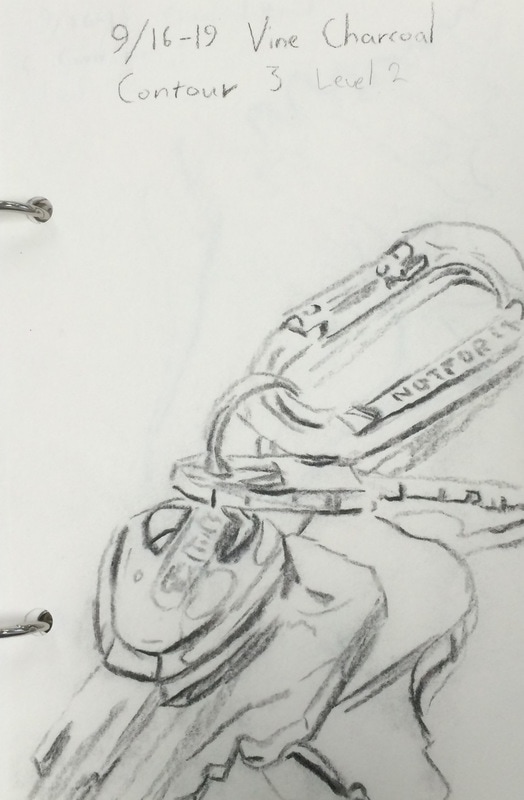
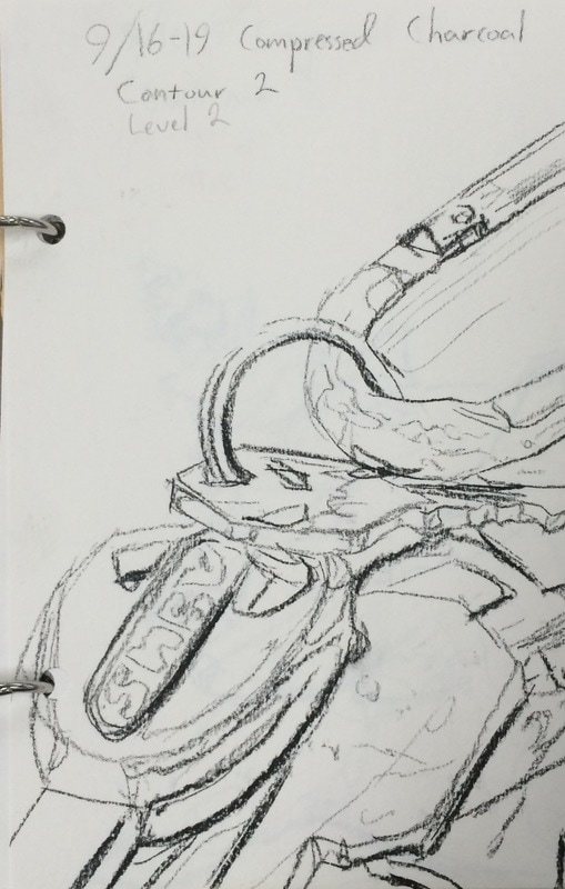
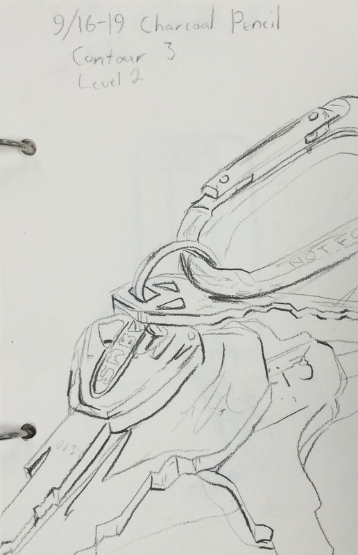
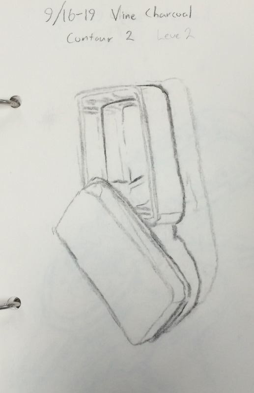
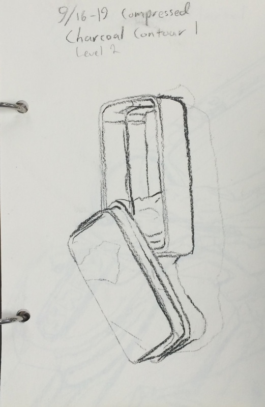
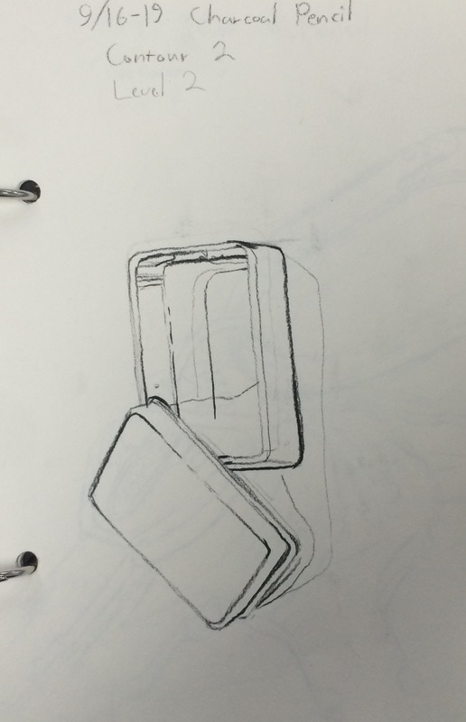
Class Assignment: Create four value scales with eight sections each. Shade each using a different method: - Vine Charcoal - Compressed Charcoal - Charcoal Pencil - 1 where you use all three. 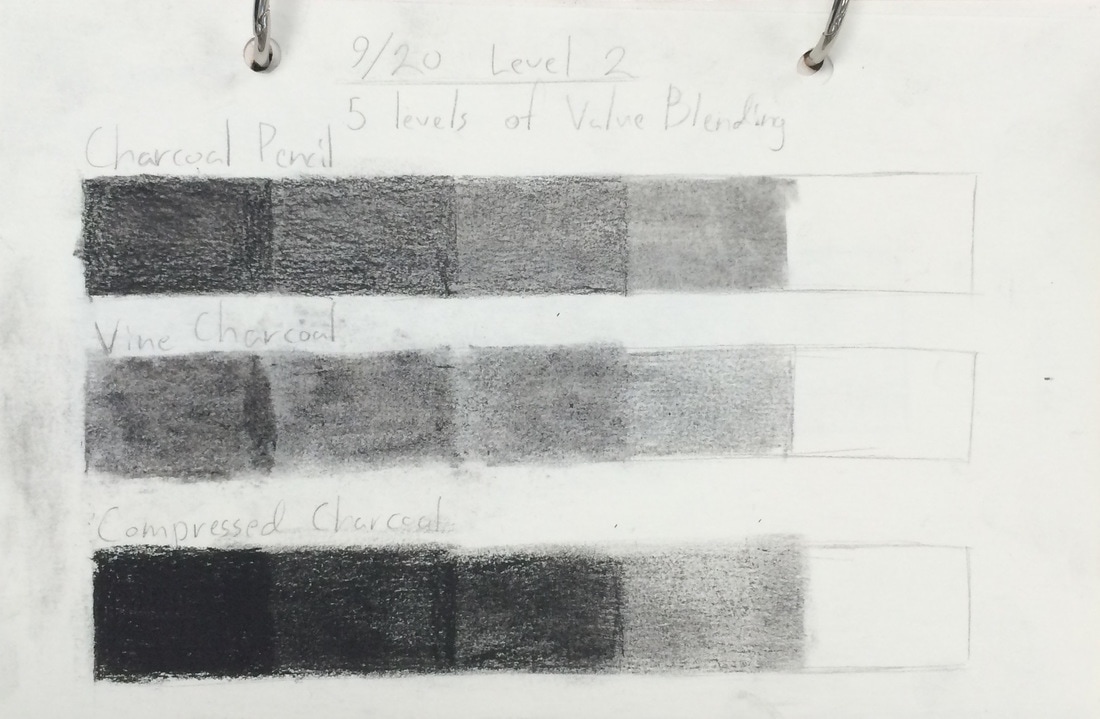 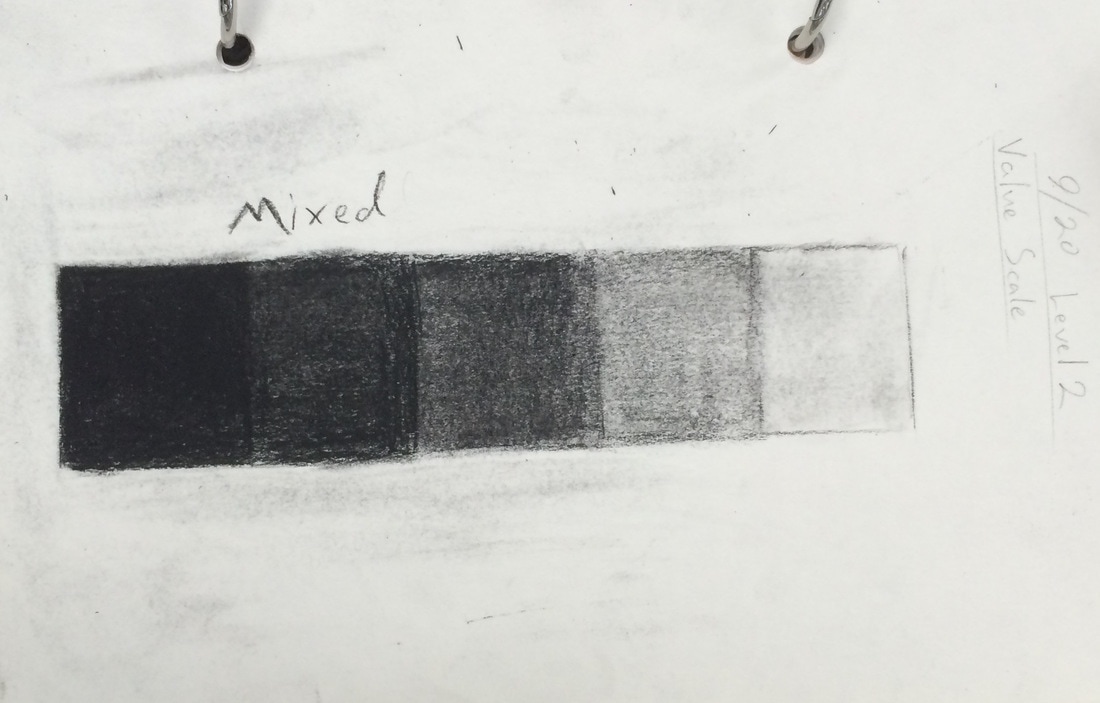 warm up: Draw the person who sits across from you (or at least near you).  Class Assignment: Create weighted line contours for:
Warm up: Draw your greatest fear. 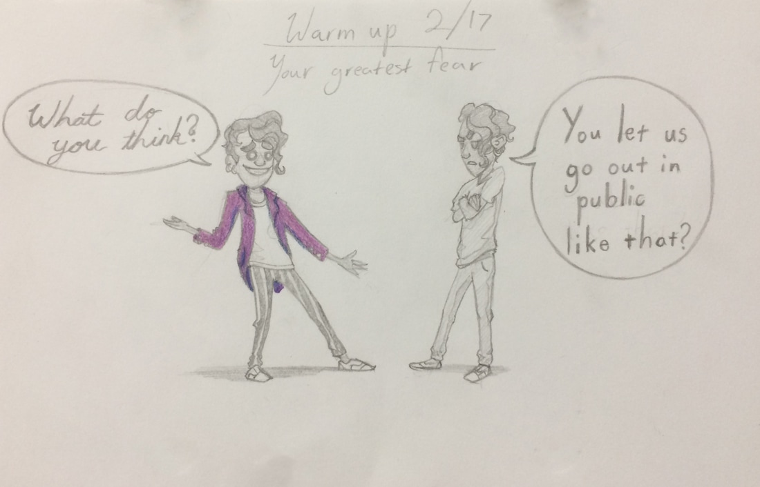 Class Assignment: Create weighted line contours for:
   Class Assignment: Take notes on Observational and Analytical drawing methods. Observational Method
Analytical Method
Warm up: Draw yourself as an animal. 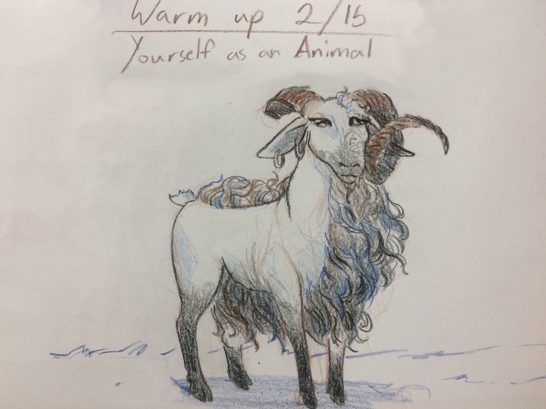 Class Assignment: Cover Collage Critique. Grab a worksheet from Mr Long, and answer some questions about your collage.
Class Assignment: Take Cornell style notes on the Principles of Design. On the left side, draw and example and on the right side, write a definition. Proportion is the feeling of unity created when all parts (sizes, amounts, or number) relate well with each other. When drawing the human figure, proportion can refer to the size of the head compared to the rest of the body. Balance is the distribution of the visual weight of objects, colors, texture, and space. If the design was a scale, these elements should be balanced to make a design feel stable. In symmetrical balance, the elements used on one side of the design are similar to those on the other side; in asymmetrical balance, the sides are different but still look balanced. In radial balance, the elements are arranged around a central point and may be similar. Movement is the path the viewer’s eye takes through the work of art, often to focal areas. Such movement can be directed along lines, edges, shape, and color within the work of art. Emphasis is the part of the design that catches the viewer’s attention. Usually the artist will make one area stand out by contrasting it with other areas. The area could be different in size, color, texture, shape, etc. Contrast is created by placing two opposing elements next to each other such as black and white or an empty space near a highly detailed pattern. Contrast helps the viewers notice elements quicker and creates visual interest through the conflict between the two elements. Variety is the use of several elements of design to hold the viewer’s attention and to guide the viewer’s eye through and around the work of art. Unity is the feeling of harmony between all parts of the work of art, which creates a sense of completeness. Pattern is the repeating of an object or symbol all over the work of art. Rhythm is created when one or more elements of design are used repeatedly to create a feeling of organized movement. Rhythm creates a mood like music or dancing. To keep rhythm exciting and active, variety is essential. |

 RSS Feed
